The context
The Centre for Humanitarian Action, or CHA, is a Berlin-based think tank connecting humanitarian research, policy and practice. Its institutional partners include Doctors Without Borders Germany, Caritas Germany, Diakonie Katastrophenhilfe and the German Red Cross.
I was comissioned to develop the creative direction and editorial illustrations for two CHA research publications: Localisation in Practice II: Implementing Risk Sharing in Humanitarian Action and Digitalisation in Humanitarian Action: To Go.
Both publications explore complex systems shaped by power, responsibility, technology and institutional change. My role was to translate this research into clear, memorable visual narratives that could help readers understand the ideas, navigate the publications and recognise the relationships connecting each argument.
Rather than using illustration as decoration, I approached the project as a form of visual storytelling and information design, creating images that could clarify complex humanitarian topics without reducing their nuance.
The challenge: illustrating complex humanitarian systems
Humanitarian action is rarely linear. It depends on relationships between crisis-affected communities, local organisations, international organisations, donors and institutions, with each actor holding different levels of knowledge, resources, influence and decision-making power.
The paper on localisation in humanitarian action examines how risk moves across this system. It considers areas such as safety and security, legal compliance, data protection, operational challenges and reputational responsibility, while questioning what happens when international organisations protect their own risk thresholds by transferring greater responsibility to local partners.
The paper on digitalisation explores another interconnected system. It examines how digital technologies, data, private-sector involvement and new forms of digital infrastructure are reshaping humanitarian work. Alongside the opportunities created by innovation, it addresses issues such as cybersecurity, data protection, misinformation, inclusion and accountability.
The editorial illustrations needed to make these relationships visible while preserving the complexity of the research. They had to guide readers through each publication, support the written arguments and translate abstract principles such as equality, mutuality, transparency, trust, representation and collective accountability into visual form.
Both projects also needed to connect with CHA’s wider visual identity and with the conference key visualI had previously created, establishing continuity across the organisation’s research, events and communications.
The concept: using illustration to make systems visible
I approached the publications as living bodies in which the values of each paper formed the skeleton, the research topics became the muscles, and the illustrations acted as the skin connecting everything and giving the ideas a recognisable form.
This conceptual framework allowed me to move beyond isolated editorial images and develop visual systems that reflected how humanitarian action actually operates: through interdependence, negotiation, movement and relationships.
Each illustration needed to work both as an individual image and as part of a wider narrative. By designing modular components that could be extracted, recombined and adapted across different layouts, I created a flexible editorial illustration system rather than a collection of static visuals.
Localisation in humanitarian action: from hierarchy to network
For Localisation in Practice II: Implementing Risk Sharing in Humanitarian Action, I created a modular illustration system representing four central groups within the humanitarian ecosystem: local communities, local organisations, international organisations and donors.
Instead of placing these actors within a conventional top-down hierarchy, I represented them as part of an interconnected network. Arrows, intersections and modular forms made the circulation of knowledge, resources, risk and responsibility visible, while showing how the decisions of one organisation can affect every other participant in the system.
This visual structure responded to the paper’s argument that humanitarian risk cannot be managed effectively by organisations acting in isolation. More equitable risk sharing requires trust, transparency, mutuality and adequate resources, supported by systems that encourage dialogue, reduce hierarchical relationships and create collective accountability.
Each visual component could be used independently to focus on a particular actor or adapted to support a specific section of the publication. When combined, the modules revealed the larger humanitarian system and the relationships holding it together.
The result was a reusable editorial illustration language that communicated the publication’s central message: effective localisation depends on distributing power, resources and responsibility more equitably rather than maintaining one dominant actor at the centre.
Digitalisation in humanitarian action: turning recommendations into a journey
For Digitalisation in Humanitarian Action: To Go, I expanded the staircase concept originally developed for CHA’s conference key visual and transformed it into an editorial framework for communicating the publication’s recommendations.
The staircase became a metaphor for digital transformation as a process built through deliberate, cumulative decisions. Rather than representing technological innovation as automatic progress, the visual narrative asked what kind of digital future humanitarian organisations should create, which principles should guide it and who should participate in shaping it.
The illustration system translated six recommendations into a connected journey:
Apply a principled approach.
Be human and transparent.
Create diversity and representation.
Design inclusive innovation and invest responsibly.
Engage and integrate across sectors.
Focus on systems thinking.
These recommendations framed digitalisation not only as a technological issue, but as a human, ethical and systemic challenge. The illustrations helped communicate the relationship between innovation, institutional responsibility and the people affected by humanitarian decisions.
The concept was adapted into one double-page editorial illustration and two smaller column-width compositions, allowing the visual narrative to guide readers at different points throughout the publication.
By developing an existing visual metaphor rather than creating an unrelated concept, I also helped CHA strengthen the connection between its conference communication, research publications and broader visual ecosystem.
The impact of the editorial illustration system
Across two research publications, the project translated four humanitarian stakeholder groups and six strategic recommendations into a coherent visual storytelling system.
The illustrations created clearer entry points into research-heavy content, helping readers recognise patterns, relationships and tensions that could be difficult to communicate through text alone. The network visualised how risk and responsibility move between humanitarian actors, while the staircase transformed digitalisation recommendations into a structured journey that readers could follow.
The modular design also increased the long-term value of the work. Adaptable compositions, extractable elements and editable source files allowed the illustrations to function across editorial layouts and future communications rather than remaining limited to a single application.
By connecting illustration, research and information design, the project helped CHA make specialist humanitarian knowledge more accessible without simplifying the issues at its core.
The result
The final editorial illustrations gave visual form to relationships that are often difficult to explain through words alone. They connected humanitarian research, visual storytelling and systems thinking to help important knowledge become clearer, more memorable and easier to share.
By making power structures, risks, responsibilities and possible paths forward visible, the illustrations helped readers understand not only what the publications were saying, but how their ideas related to one another and why they mattered.
Because when complex information becomes clearer, it becomes easier to question, discuss and act upon.
My role
Creative direction, art direction, visual research, concept development, editorial illustration, visual storytelling, information design, modular illustration system, adaptation of an existing key visual, layout integration and final artwork.
The context
The Centre for Humanitarian Action, or CHA, is a Berlin-based think tank connecting humanitarian research, policy and practice. Its institutional partners include Doctors Without Borders Germany, Caritas Germany, Diakonie Katastrophenhilfe and the German Red Cross.
I was comissioned to develop the creative direction and editorial illustrations for two CHA research publications: Localisation in Practice II: Implementing Risk Sharing in Humanitarian Action and Digitalisation in Humanitarian Action: To Go.
Both publications explore complex systems shaped by power, responsibility, technology and institutional change. My role was to translate this research into clear, memorable visual narratives that could help readers understand the ideas, navigate the publications and recognise the relationships connecting each argument.
Rather than using illustration as decoration, I approached the project as a form of visual storytelling and information design, creating images that could clarify complex humanitarian topics without reducing their nuance.
The challenge: illustrating complex humanitarian systems
Humanitarian action is rarely linear. It depends on relationships between crisis-affected communities, local organisations, international organisations, donors and institutions, with each actor holding different levels of knowledge, resources, influence and decision-making power.
The paper on localisation in humanitarian action examines how risk moves across this system. It considers areas such as safety and security, legal compliance, data protection, operational challenges and reputational responsibility, while questioning what happens when international organisations protect their own risk thresholds by transferring greater responsibility to local partners.
The paper on digitalisation explores another interconnected system. It examines how digital technologies, data, private-sector involvement and new forms of digital infrastructure are reshaping humanitarian work. Alongside the opportunities created by innovation, it addresses issues such as cybersecurity, data protection, misinformation, inclusion and accountability.
The editorial illustrations needed to make these relationships visible while preserving the complexity of the research. They had to guide readers through each publication, support the written arguments and translate abstract principles such as equality, mutuality, transparency, trust, representation and collective accountability into visual form.
Both projects also needed to connect with CHA’s wider visual identity and with the conference key visualI had previously created, establishing continuity across the organisation’s research, events and communications.
The concept: using illustration to make systems visible
I approached the publications as living bodies in which the values of each paper formed the skeleton, the research topics became the muscles, and the illustrations acted as the skin connecting everything and giving the ideas a recognisable form.
This conceptual framework allowed me to move beyond isolated editorial images and develop visual systems that reflected how humanitarian action actually operates: through interdependence, negotiation, movement and relationships.
Each illustration needed to work both as an individual image and as part of a wider narrative. By designing modular components that could be extracted, recombined and adapted across different layouts, I created a flexible editorial illustration system rather than a collection of static visuals.
Localisation in humanitarian action: from hierarchy to network
For Localisation in Practice II: Implementing Risk Sharing in Humanitarian Action, I created a modular illustration system representing four central groups within the humanitarian ecosystem: local communities, local organisations, international organisations and donors.
Instead of placing these actors within a conventional top-down hierarchy, I represented them as part of an interconnected network. Arrows, intersections and modular forms made the circulation of knowledge, resources, risk and responsibility visible, while showing how the decisions of one organisation can affect every other participant in the system.
This visual structure responded to the paper’s argument that humanitarian risk cannot be managed effectively by organisations acting in isolation. More equitable risk sharing requires trust, transparency, mutuality and adequate resources, supported by systems that encourage dialogue, reduce hierarchical relationships and create collective accountability.
Each visual component could be used independently to focus on a particular actor or adapted to support a specific section of the publication. When combined, the modules revealed the larger humanitarian system and the relationships holding it together.
The result was a reusable editorial illustration language that communicated the publication’s central message: effective localisation depends on distributing power, resources and responsibility more equitably rather than maintaining one dominant actor at the centre.
Digitalisation in humanitarian action: turning recommendations into a journey
For Digitalisation in Humanitarian Action: To Go, I expanded the staircase concept originally developed for CHA’s conference key visual and transformed it into an editorial framework for communicating the publication’s recommendations.
The staircase became a metaphor for digital transformation as a process built through deliberate, cumulative decisions. Rather than representing technological innovation as automatic progress, the visual narrative asked what kind of digital future humanitarian organisations should create, which principles should guide it and who should participate in shaping it.
The illustration system translated six recommendations into a connected journey:
Apply a principled approach.
Be human and transparent.
Create diversity and representation.
Design inclusive innovation and invest responsibly.
Engage and integrate across sectors.
Focus on systems thinking.
These recommendations framed digitalisation not only as a technological issue, but as a human, ethical and systemic challenge. The illustrations helped communicate the relationship between innovation, institutional responsibility and the people affected by humanitarian decisions.
The concept was adapted into one double-page editorial illustration and two smaller column-width compositions, allowing the visual narrative to guide readers at different points throughout the publication.
By developing an existing visual metaphor rather than creating an unrelated concept, I also helped CHA strengthen the connection between its conference communication, research publications and broader visual ecosystem.
The impact of the editorial illustration system
Across two research publications, the project translated four humanitarian stakeholder groups and six strategic recommendations into a coherent visual storytelling system.
The illustrations created clearer entry points into research-heavy content, helping readers recognise patterns, relationships and tensions that could be difficult to communicate through text alone. The network visualised how risk and responsibility move between humanitarian actors, while the staircase transformed digitalisation recommendations into a structured journey that readers could follow.
The modular design also increased the long-term value of the work. Adaptable compositions, extractable elements and editable source files allowed the illustrations to function across editorial layouts and future communications rather than remaining limited to a single application.
By connecting illustration, research and information design, the project helped CHA make specialist humanitarian knowledge more accessible without simplifying the issues at its core.
The result
The final editorial illustrations gave visual form to relationships that are often difficult to explain through words alone. They connected humanitarian research, visual storytelling and systems thinking to help important knowledge become clearer, more memorable and easier to share.
By making power structures, risks, responsibilities and possible paths forward visible, the illustrations helped readers understand not only what the publications were saying, but how their ideas related to one another and why they mattered.
Because when complex information becomes clearer, it becomes easier to question, discuss and act upon.
My role
Creative direction, art direction, visual research, concept development, editorial illustration, visual storytelling, information design, modular illustration system, adaptation of an existing key visual, layout integration and final artwork.

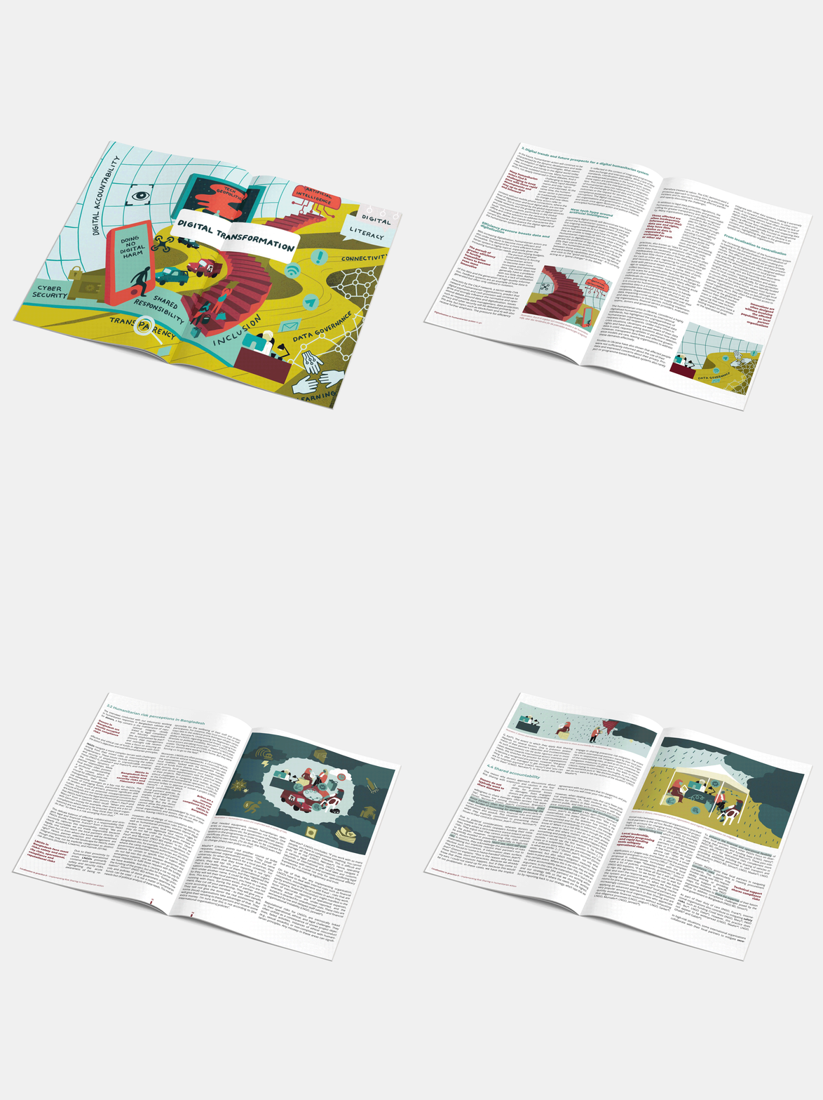 Image 1 of 18
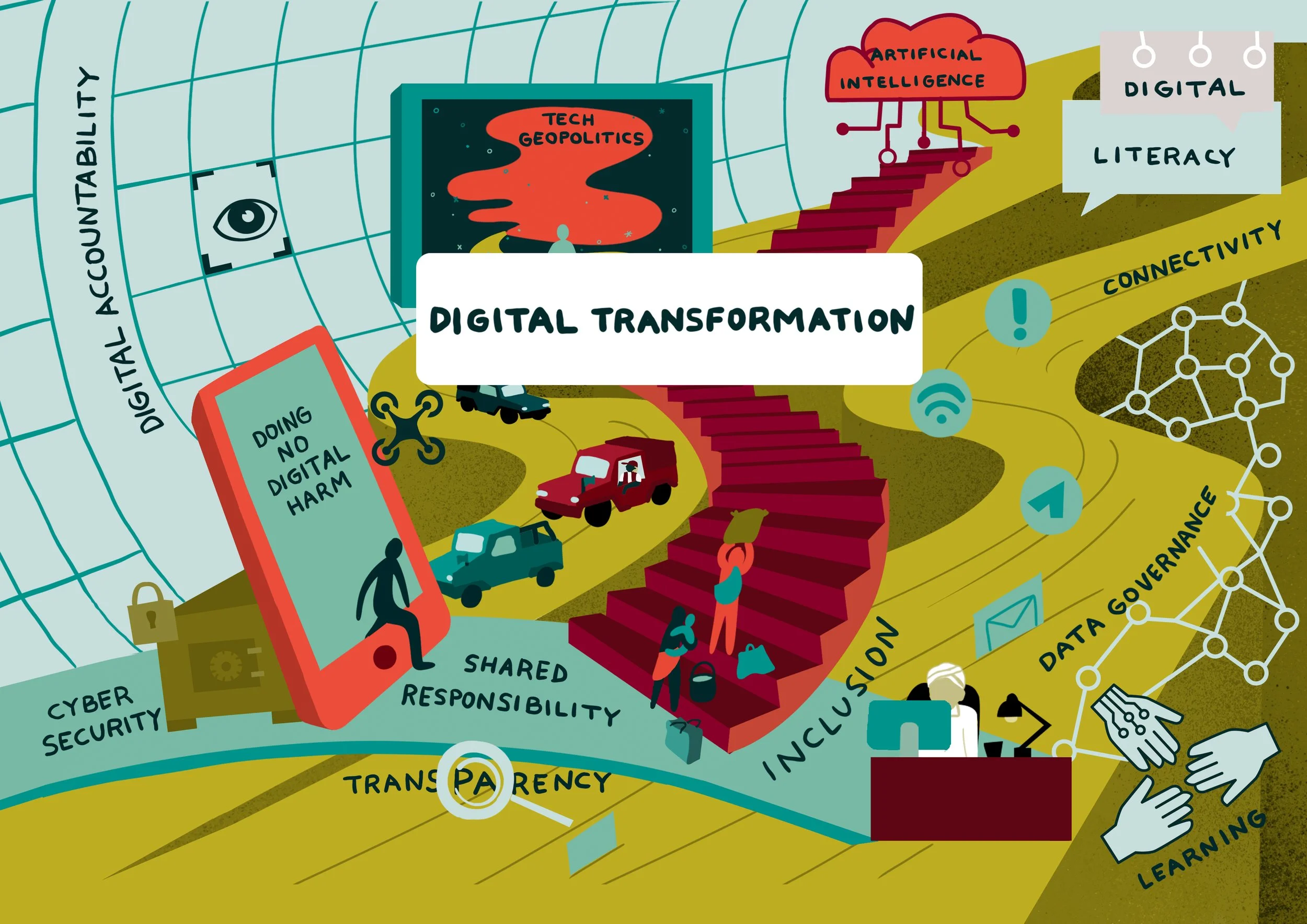 Image 2 of 18
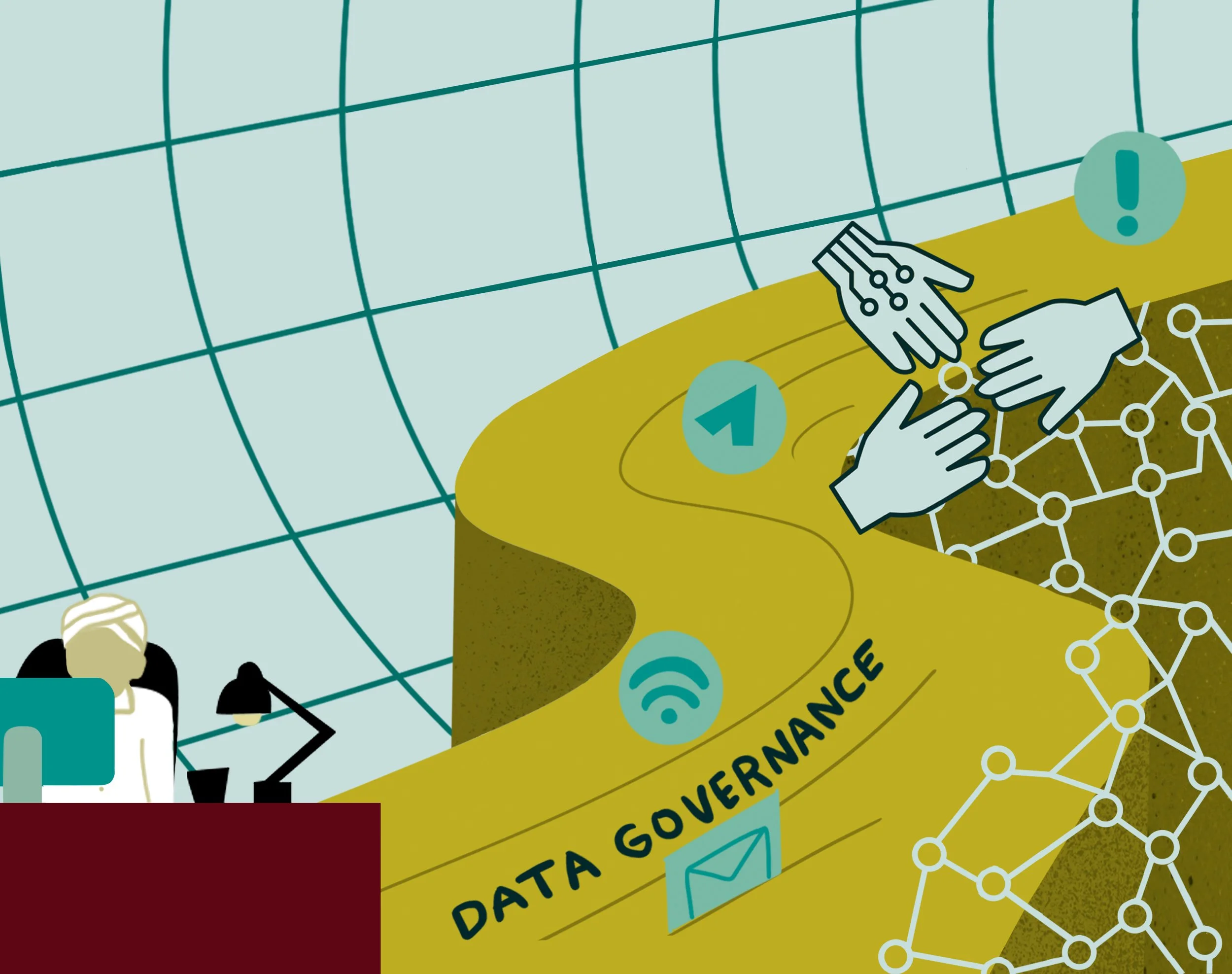 Image 3 of 18
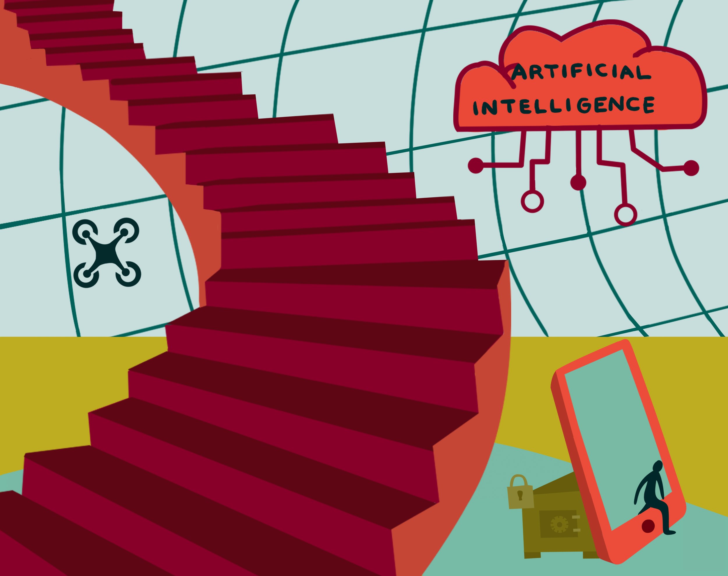 Image 4 of 18
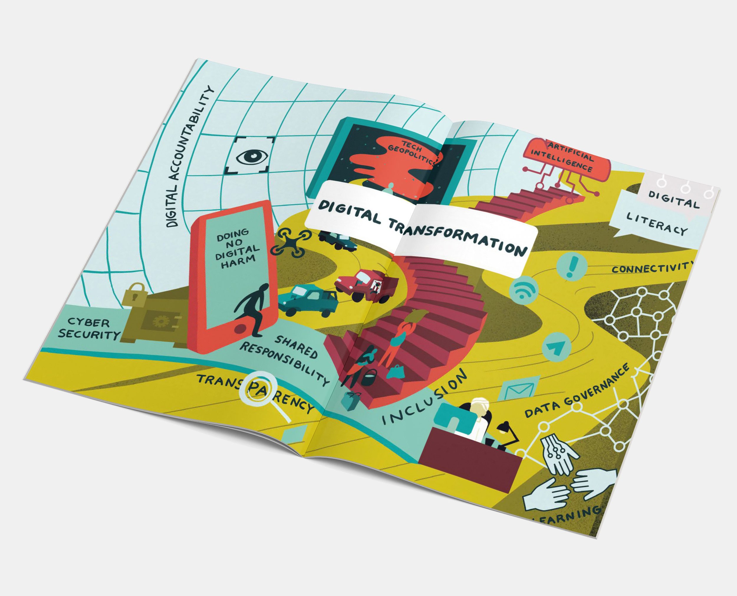 Image 5 of 18
 Image 6 of 18
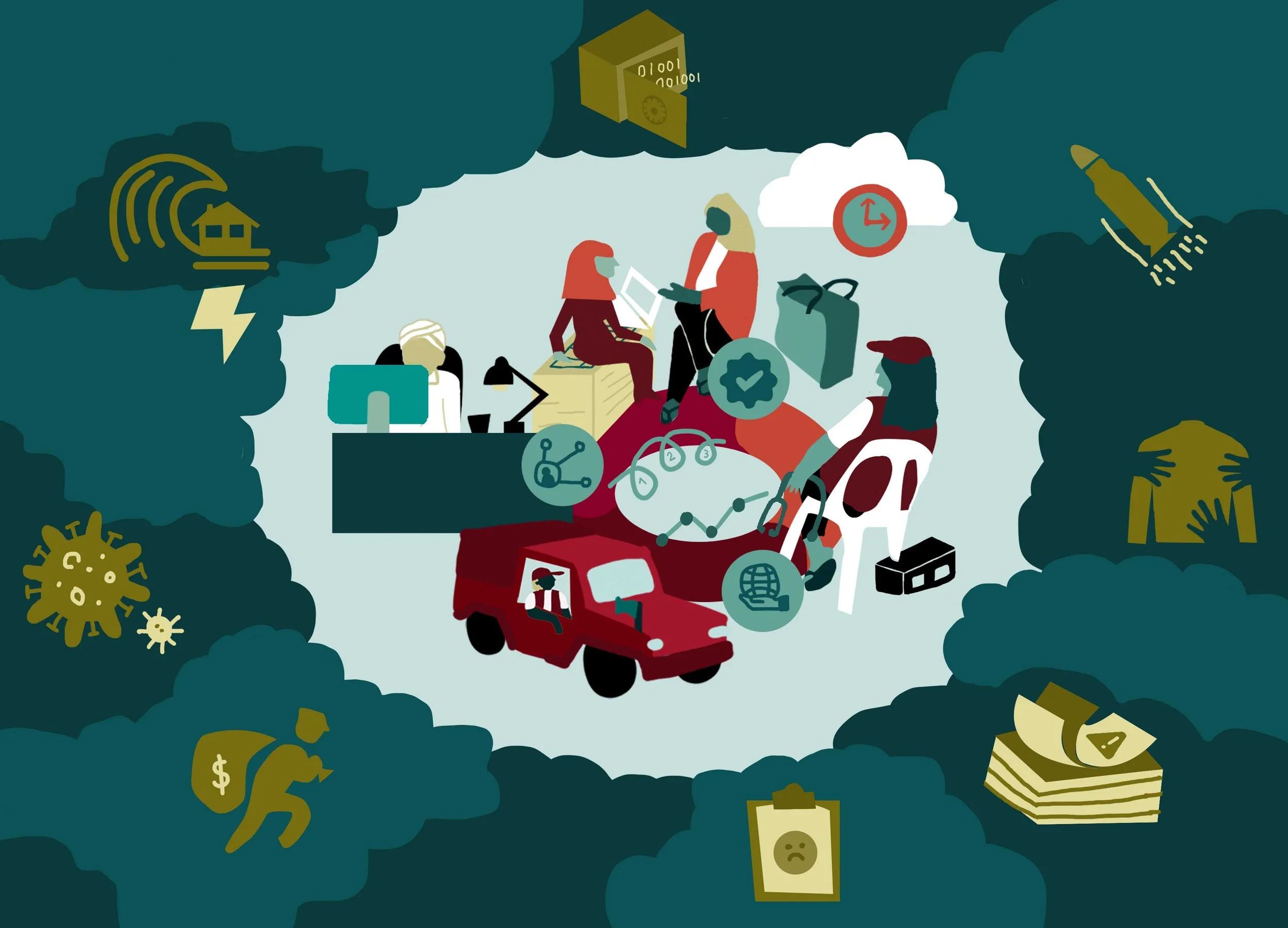 Image 7 of 18
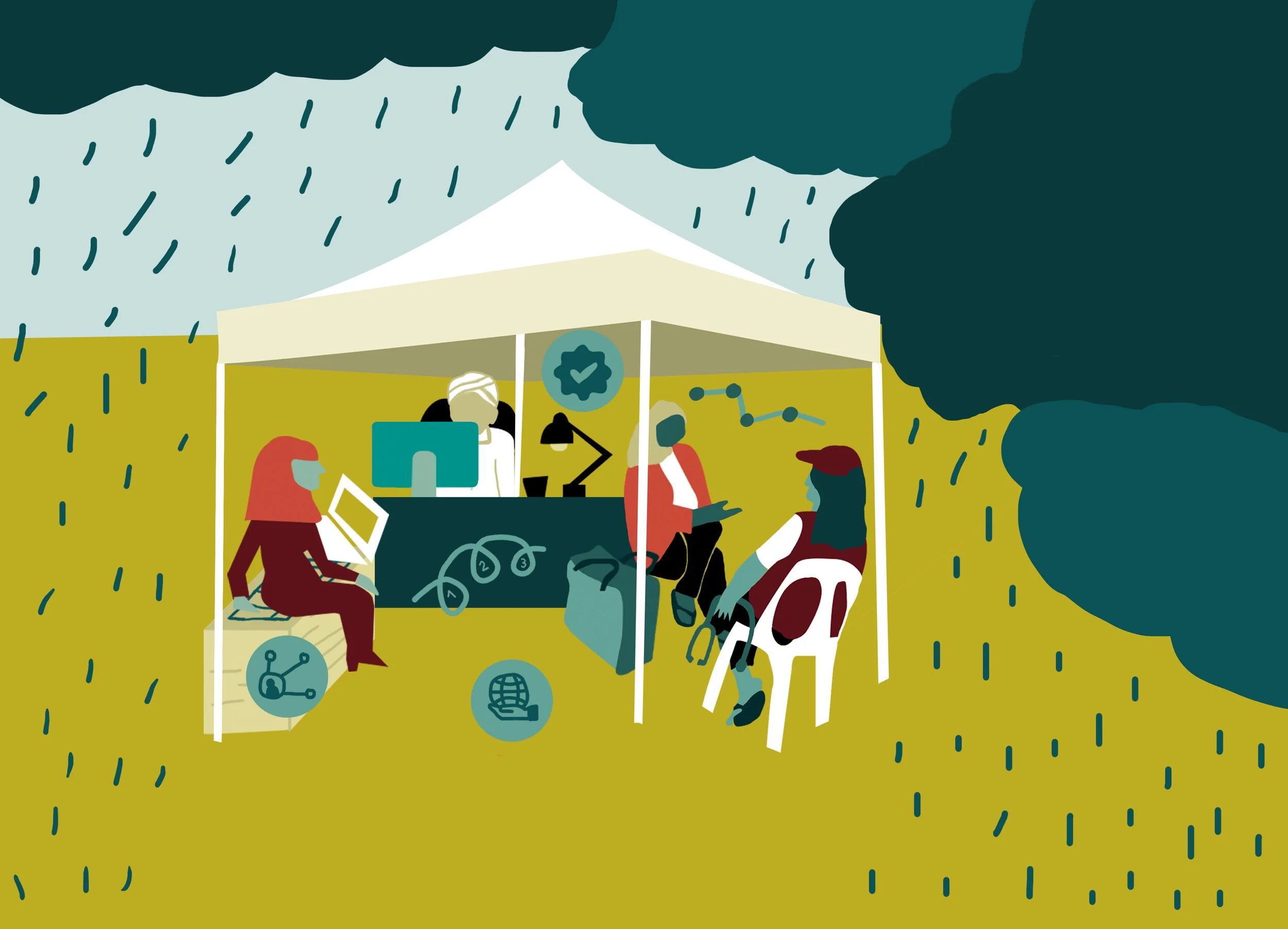 Image 8 of 18
 Image 9 of 18
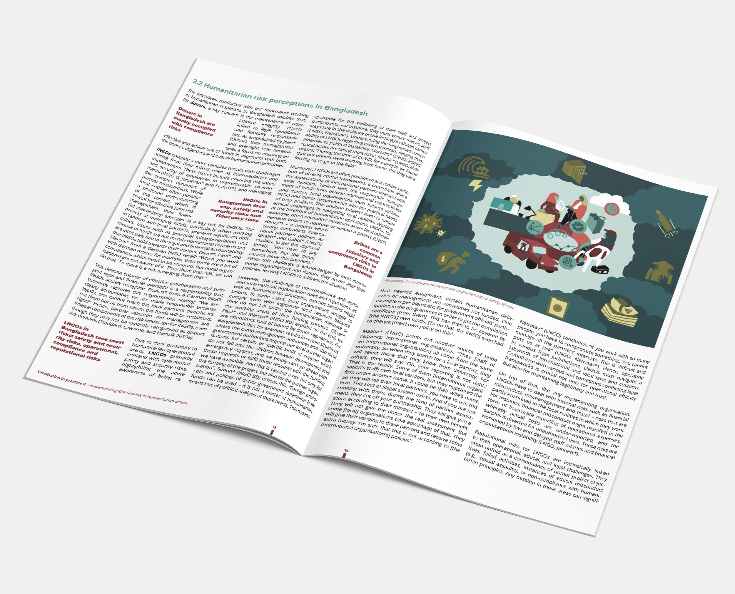 Image 10 of 18
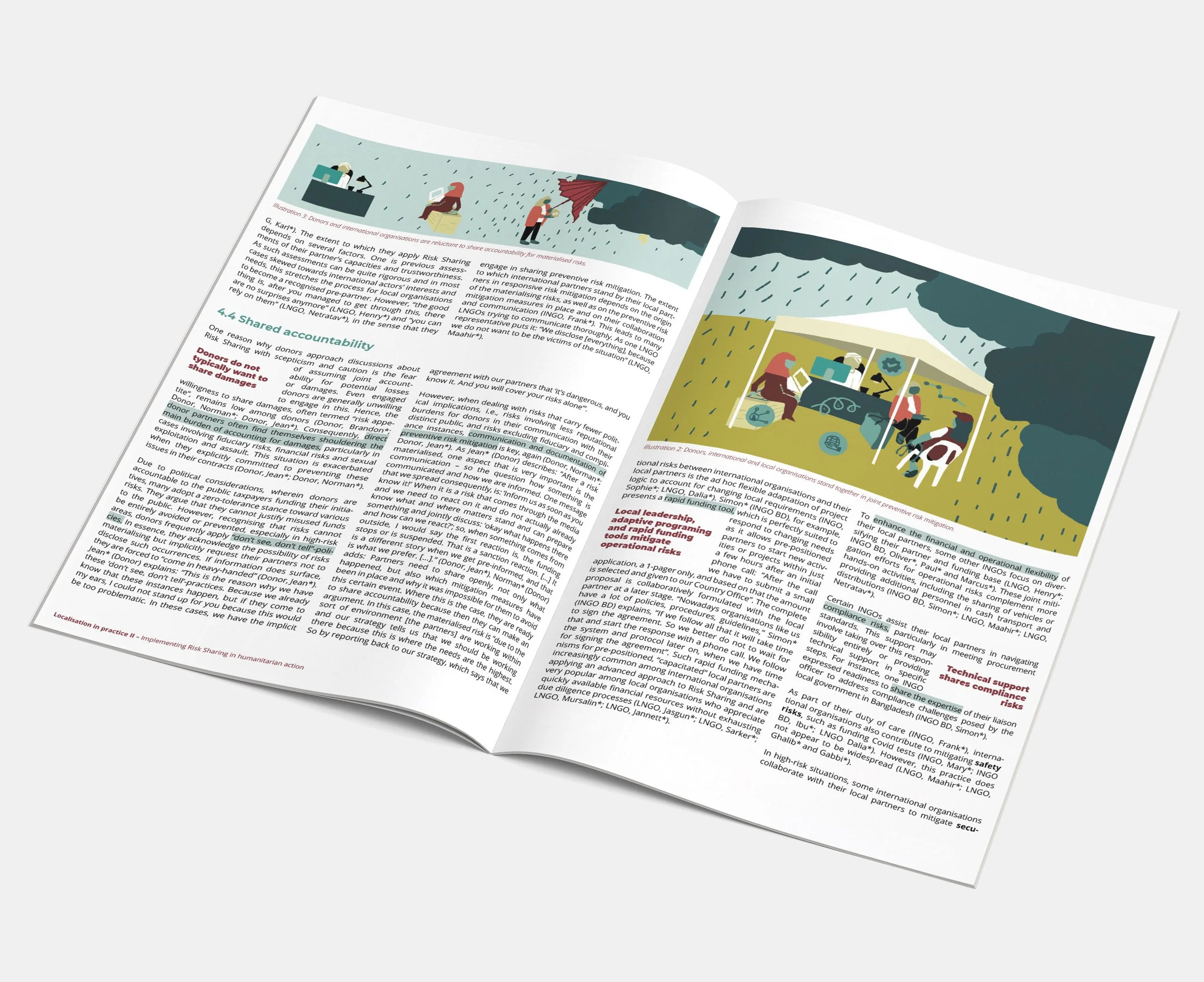 Image 11 of 18
 Image 12 of 18
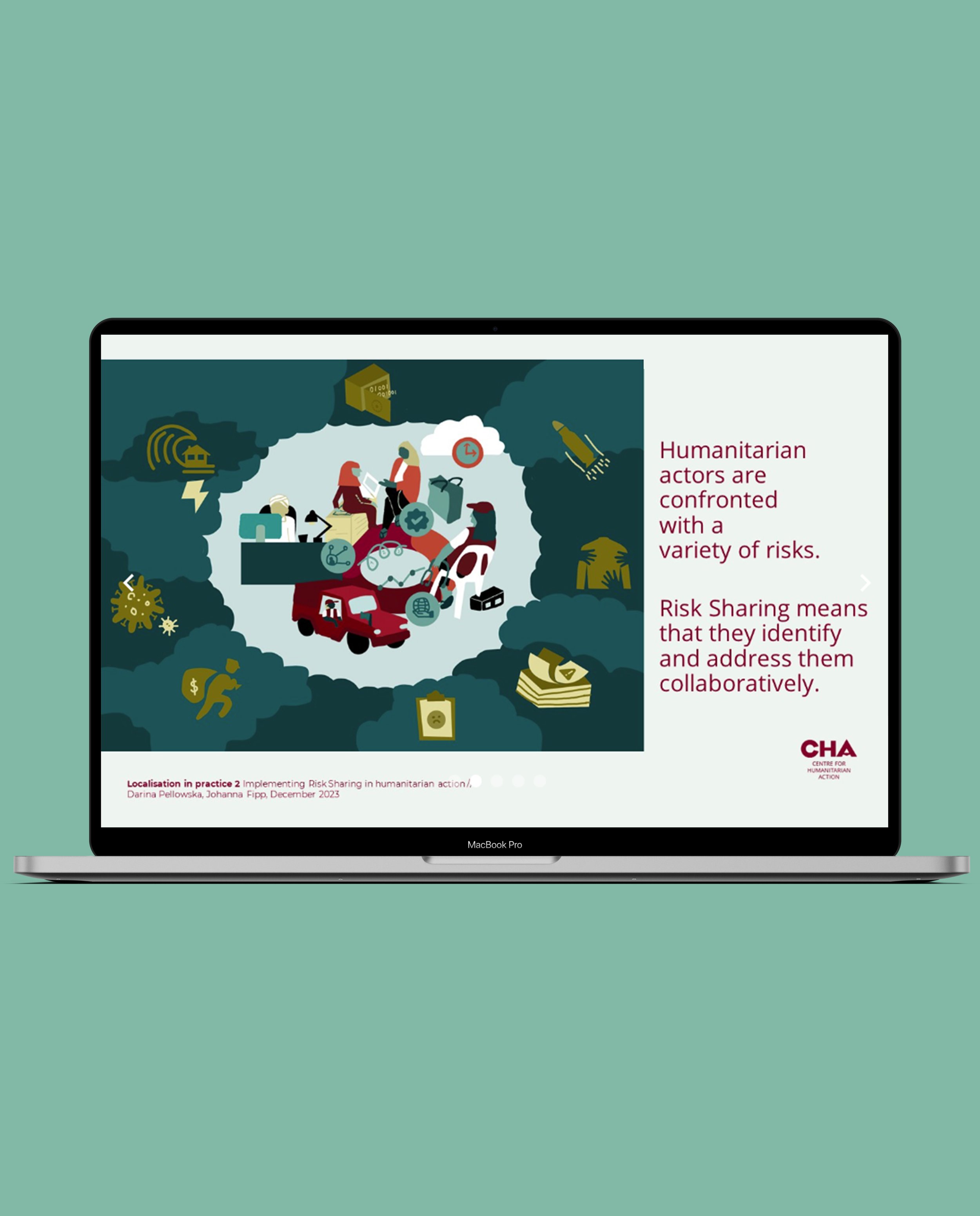 Image 13 of 18
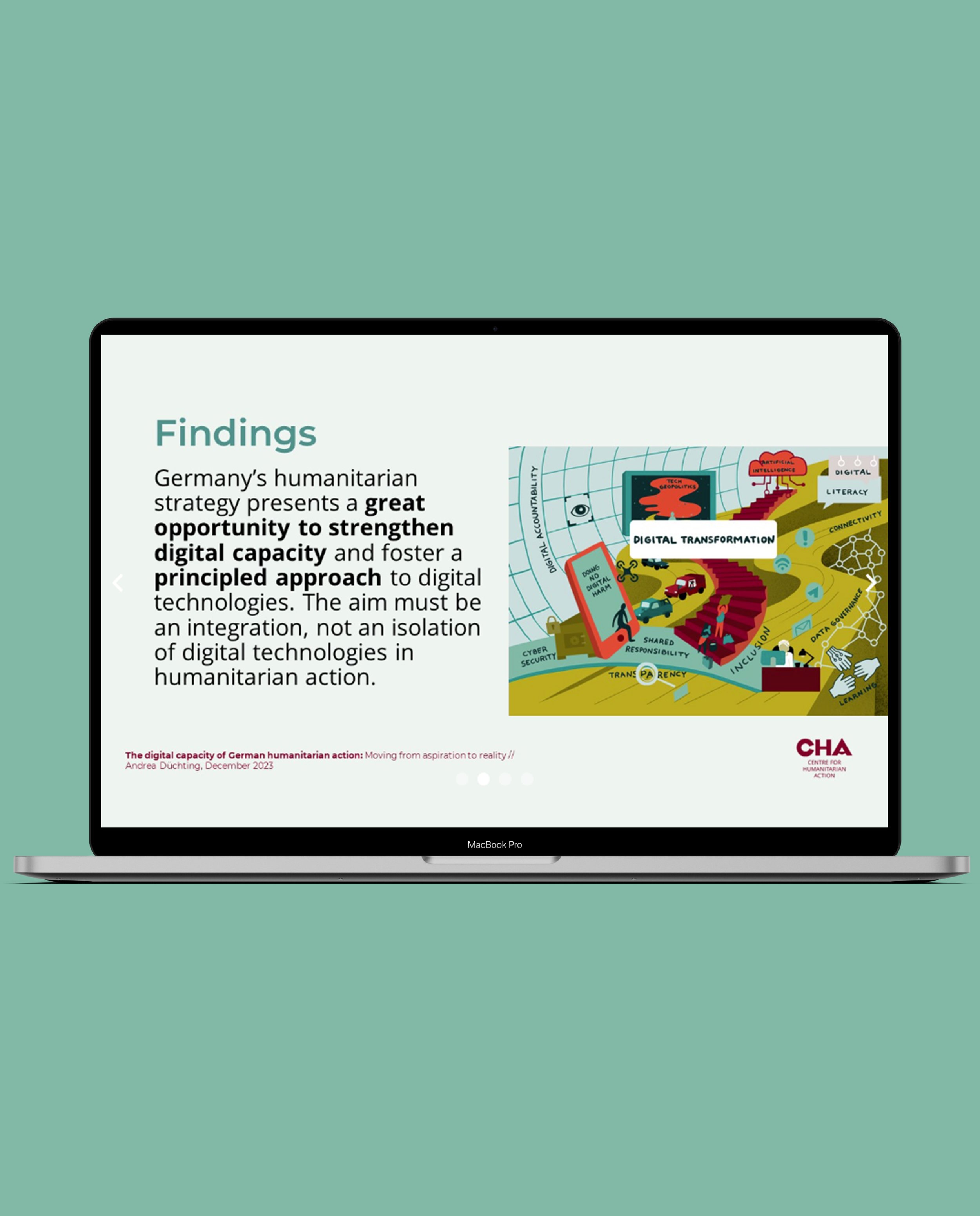 Image 14 of 18
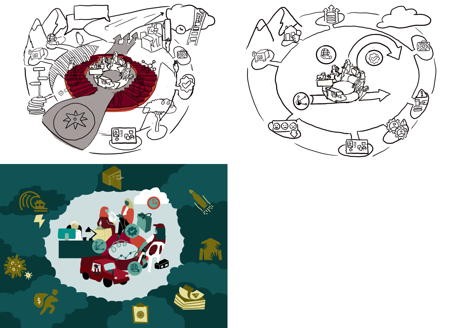 Image 15 of 18
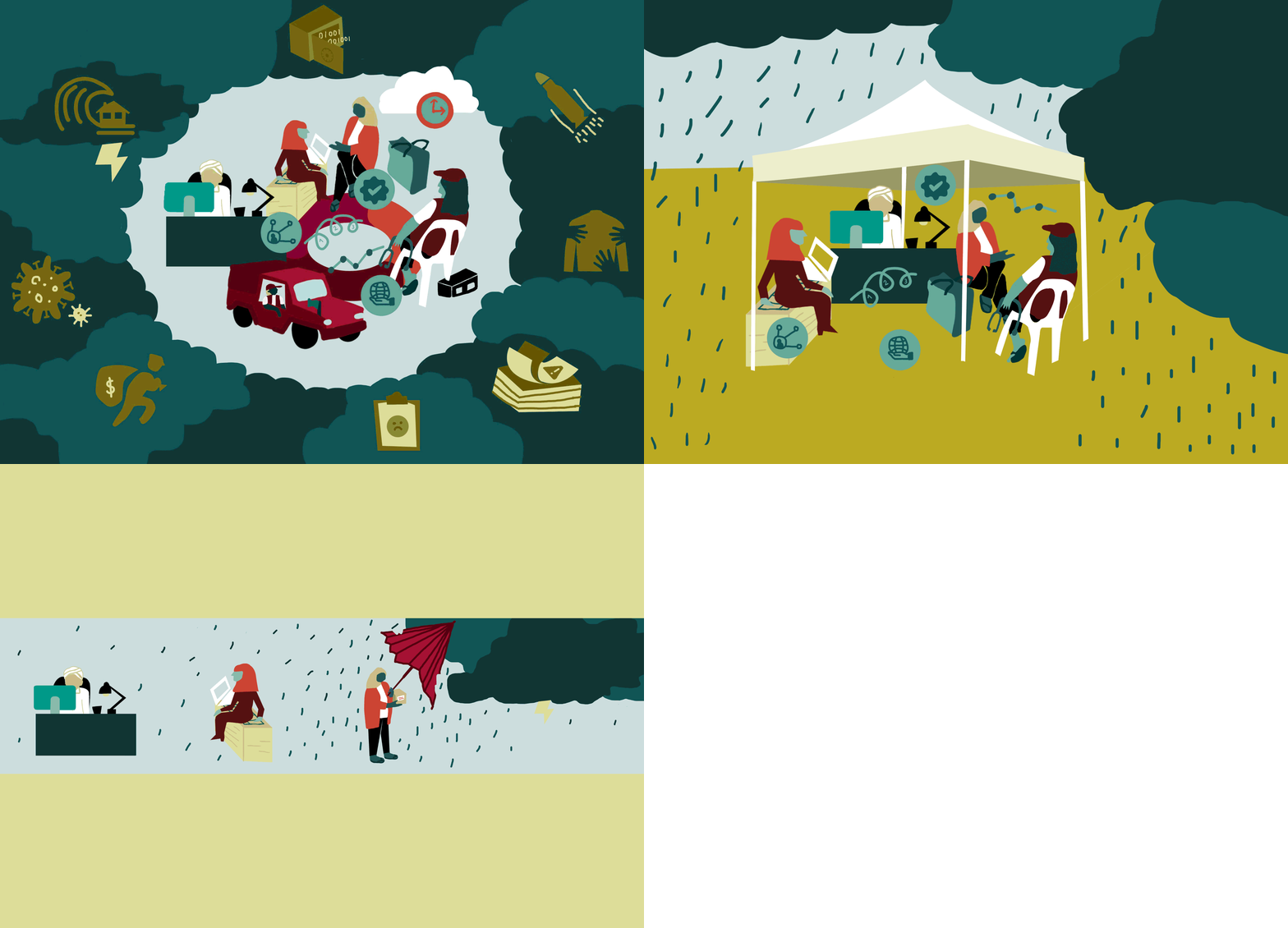 Image 16 of 18
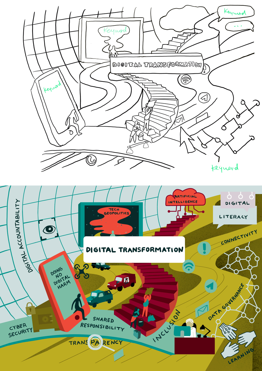 Image 17 of 18
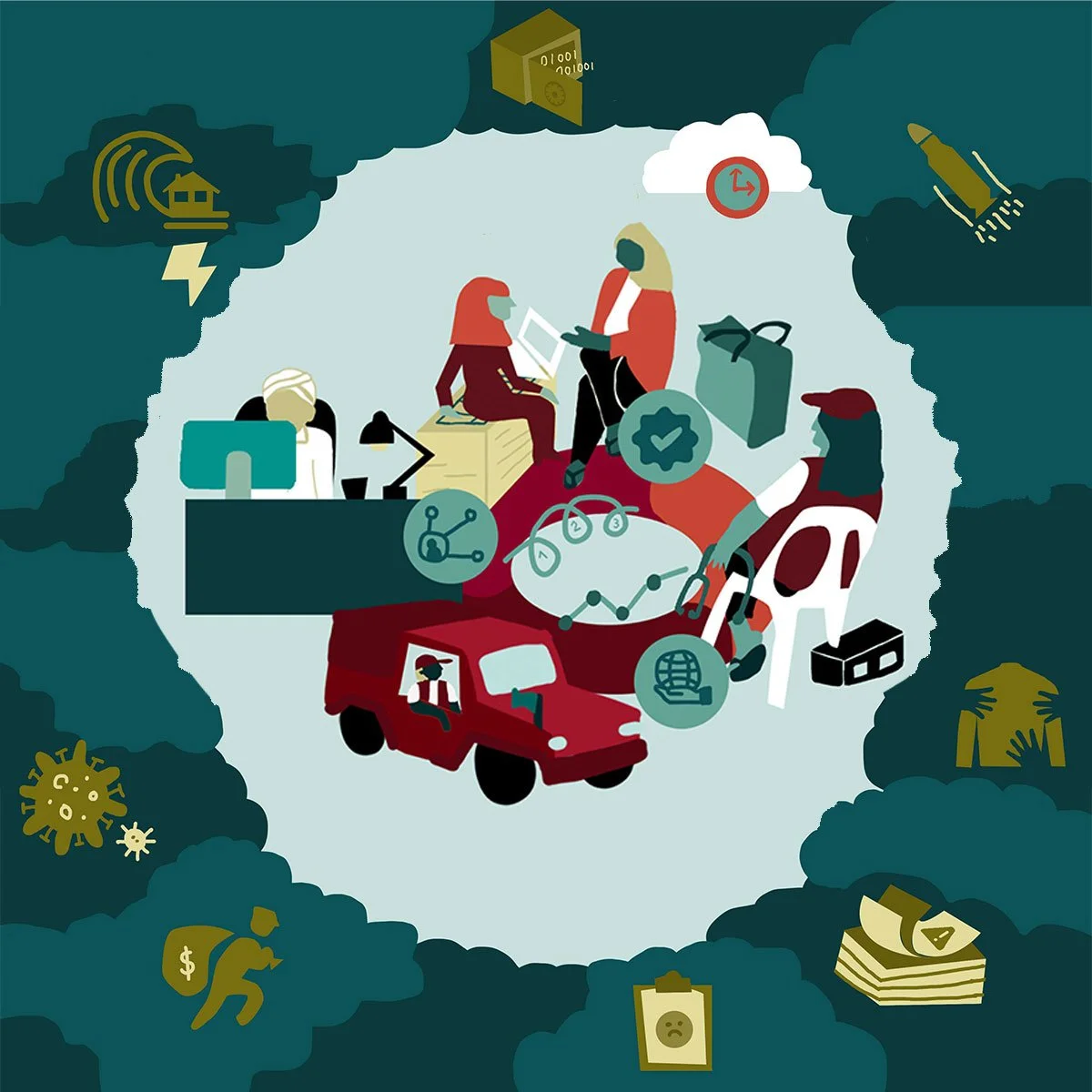 Image 18 of 18