For the Key Visual for the Centre for Humanitarian Action Annual Conference 2023, titled: ‘Tackling power imbalances in humanitarian action - with technology and locally led management?’, it was essential that the outcome of the Key Visual made ‘equitable partnership’ and ‘power imbalances’ between the individual actors in humanitarian aid quickly visible.
In humanitarian work, when trying to convey the importance and urgency of a project, effective communication of key visuals is essential to make projects understood and presented to a diverse audience, including policymakers, donors, beneficiaries, and fellow humanitarians.
CHA’s conference this year aimed to emphasize and question how tackling power imbalances in humanitarian action with technology and locally-led management, in equitable partnership. That means that everyone had the same power and voice, and the inflection point of the conference was stating how power imbalances can be tackled with local management and data sovereignty, with the affected people leading the way out of the situation.
It was important that the 4 actors in humanitarian action were represented. In the middle leading the way are the Affected People. To their right, local NGOs. To the left of the Affected people, International NGOs and Donors above.
Parting from the power imbalance statement and understanding that the intention and work are to achieve greater balance, we came to the notion of equity as a concept to be represented with symmetry or an attempt at an exact correspondence between different things.
In turn, the Key Visual Illustration we developed highlighted different digitalization and management icons and attributes in the stream that lead up to and make these systems of interactions and reflect on, whether can digital solutions not replicate the imbalances, and introduce new ways.
The ‘liquid bubbles’ compose the whole, representing the partnership and coming together in humanitarian action. They are connected but are different. Nonetheless, you can see that this partnership is imbalanced because the International humanitarian organizations and Donors’ ‘liquid bubbles’ are bigger and outweigh the others.
The quadrants also suggest the idea or attempt of symmetry, the possibility of movement, and expansion. In the middle, affected people appear again to show the locally-led aspect and emphasize affected people leading their way out of the situation with voice, digital literacy, and sovereignty.
There are elements in the composition that show variations between context and situation, creating the different bubbles modularly so they could be used individually to represent each group or come together to represent all aspects of the conference.
We also took into consideration creating individual elements that were designed to be adapted in different communication pieces such as presentation slides, social media, and marketing assets.
Humanitarian work often revolves around stories of impact and change. Our key visual aimed to emphasize specific challenges and contributes to the broader goals of humanitarian work.
You can see the full case study here.
©Liesa Johannssen Photography / CHA
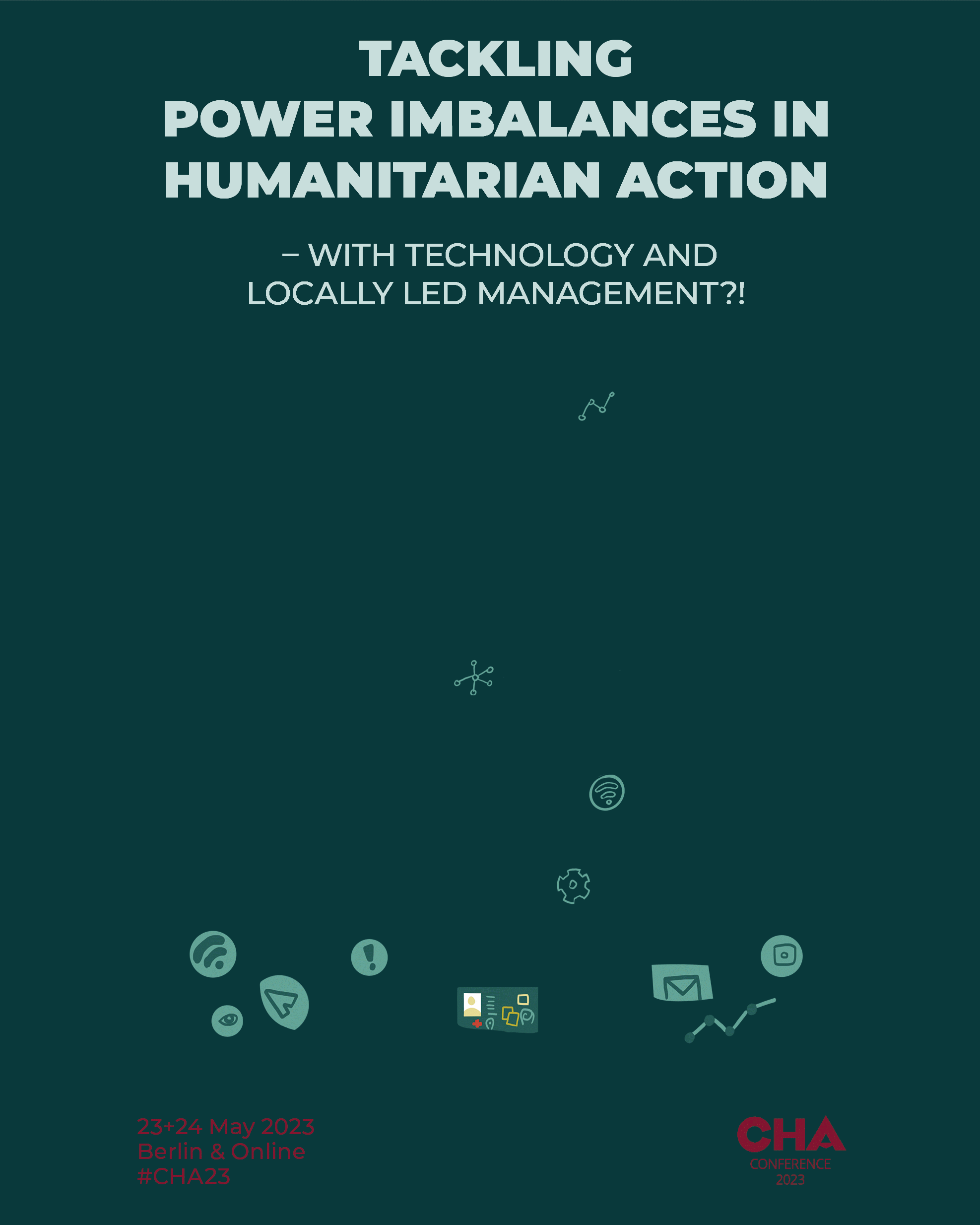 Image 1 of 13
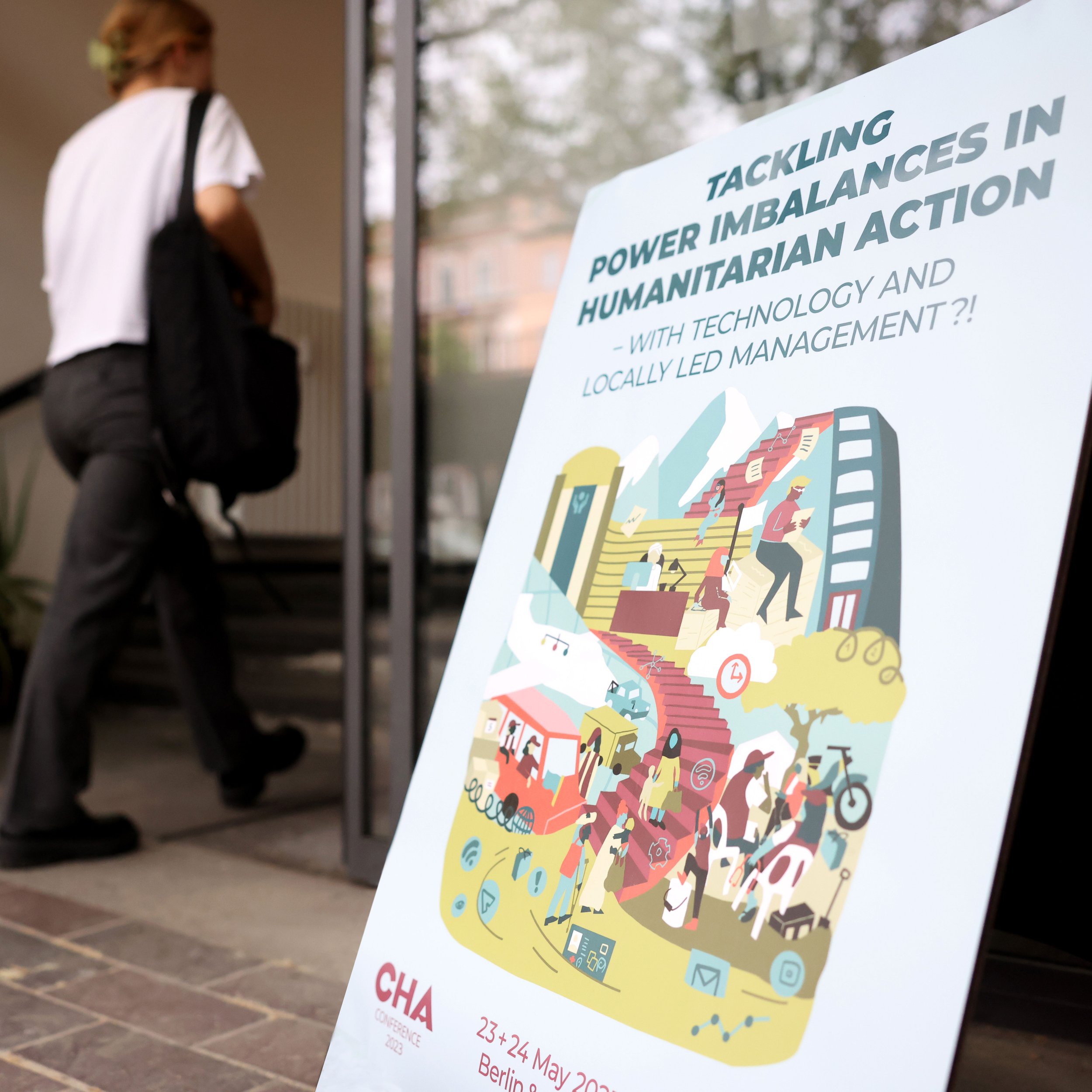 Image 2 of 13
 Image 3 of 13
 Image 4 of 13
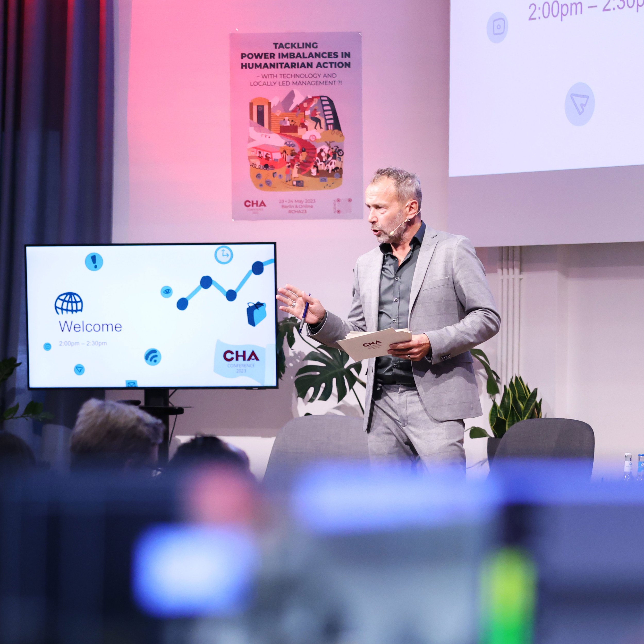 Image 5 of 13
 Image 6 of 13
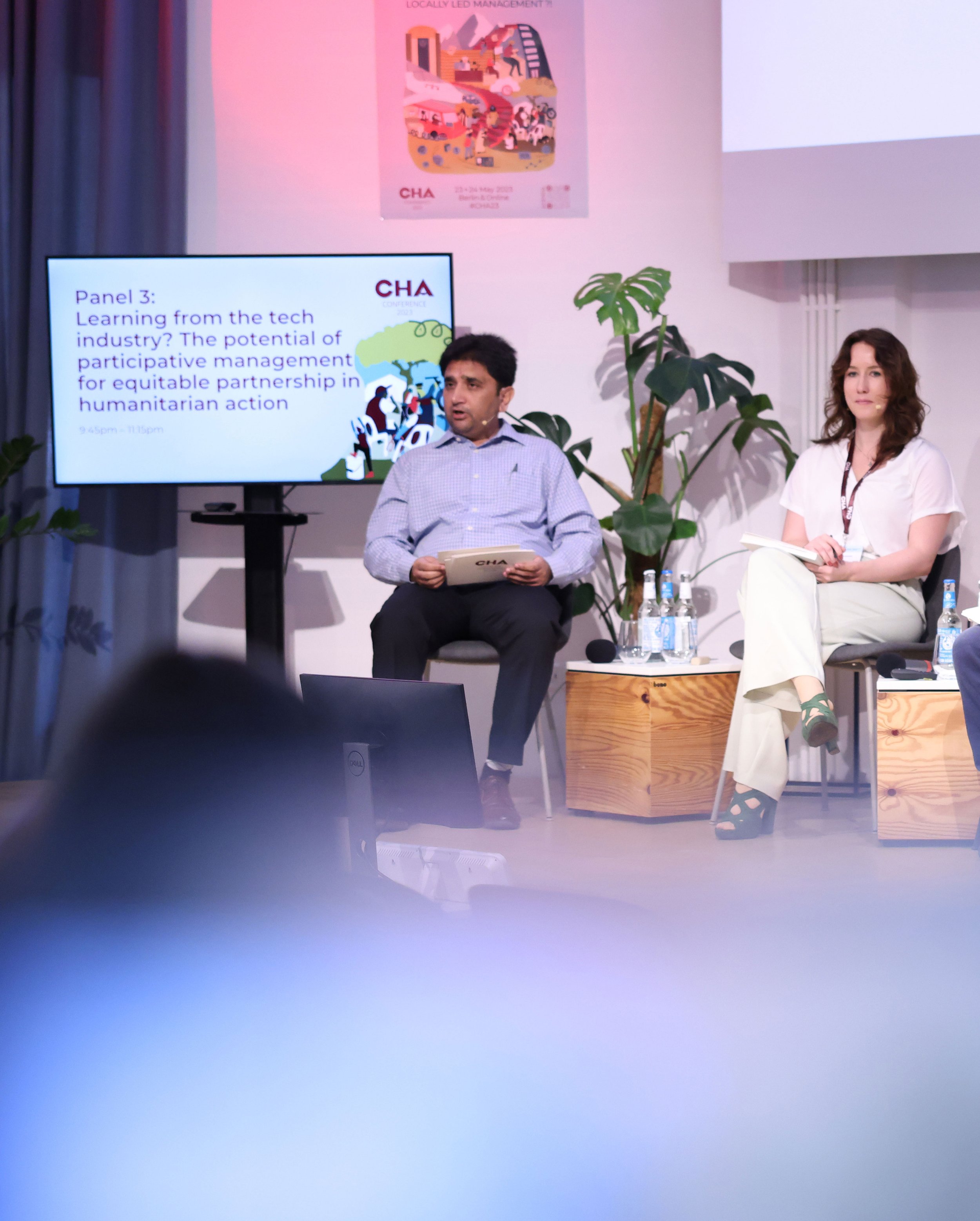 Image 7 of 13
 Image 8 of 13
 Image 9 of 13
 Image 10 of 13
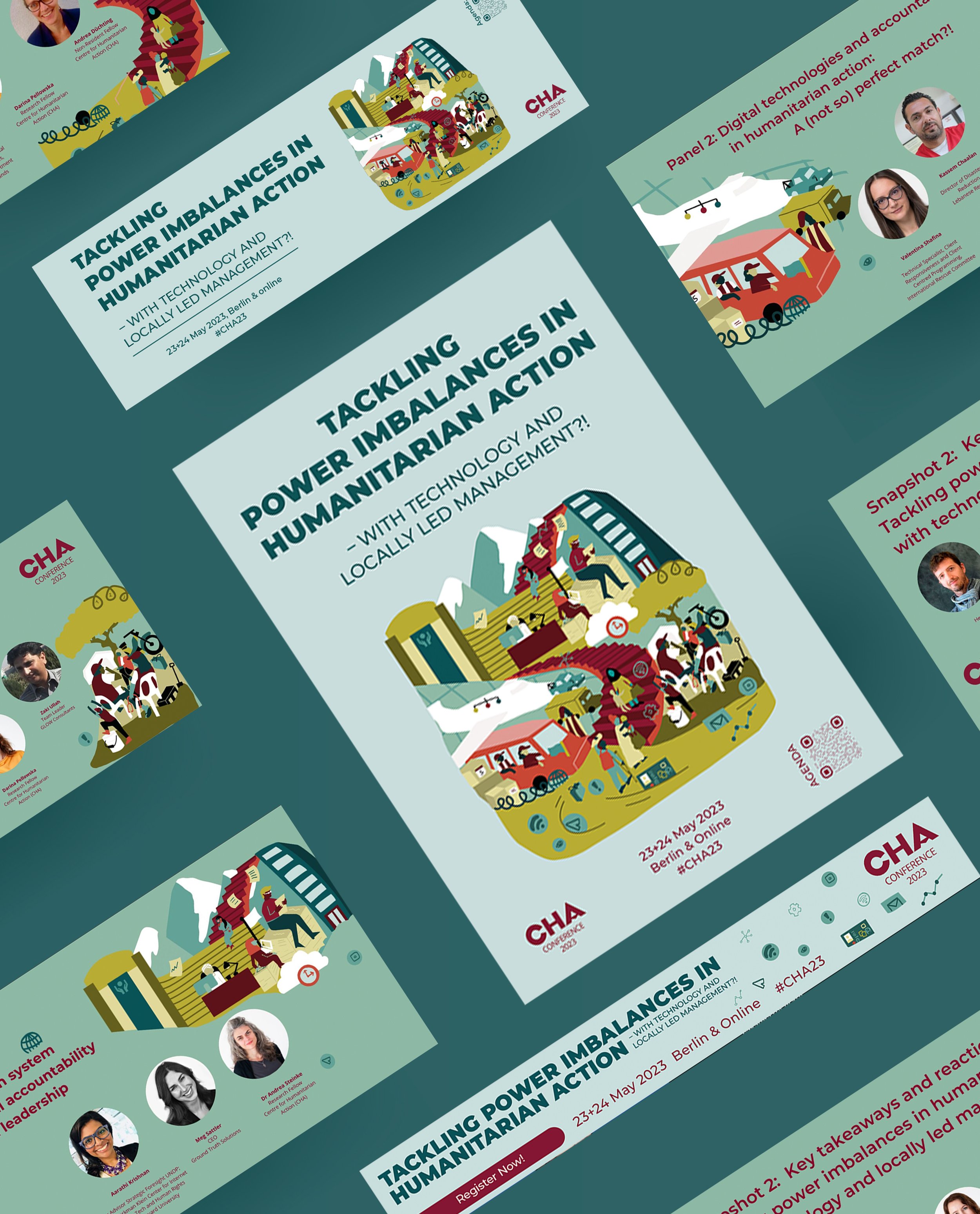 Image 11 of 13
 Image 12 of 13
 Image 13 of 13