The Brand Identity Development of Hace La Fuerza is a strategic communication project to build the brand by highlighting its values through storytelling and creative design. We created a set of flexible guidelines that express the brand’s personality, philosophy and mission, ir order to highlight the Social Impact Venture’s difference through tone, art direction, complementary graphics, colors, typographies & logos.
This branding project crafted & boosted their story with creative, communication & design tools to cohesively & empathically convey what the org. is: Hace La Fuerza is a community of women that seeks to contribute to the reduction of the gender gap in the professional & academic fields in Latin America.
We developed the symbol of Hace La Fuerza from the concept: To unite & mesh different forces & users, because unity is strength, & together we are stronger. The Organization acts as a magnet that connects mentors with mentees, so we de decided to use the U from the logo’s wordmark as the magnet that generates the ‘match’ for the mentorship. The ‘magnetic force’ shape is also the background of the wordmark, and is reminiscing of a ladder, of building blocks. (All brand elements tell a story (with a smart, straightforward & approachable tone ^_^).
*There are 5 pillars to the project (Community, By Women for Women, Professional Development, Regional Perspective, Strength), each one represented by an illustration (that can be used as a whole, or in (customizable) fragments either as background texture or within a circle.
Hace La Fuerza’s website was designed by Andrea Terminel
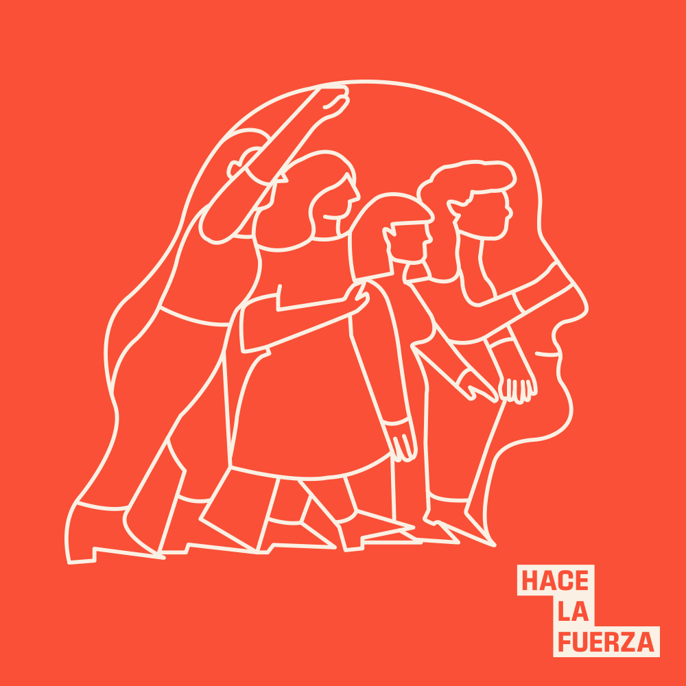 Image 1 of 16
 Image 2 of 16
 Image 3 of 16
 Image 4 of 16
 Image 5 of 16
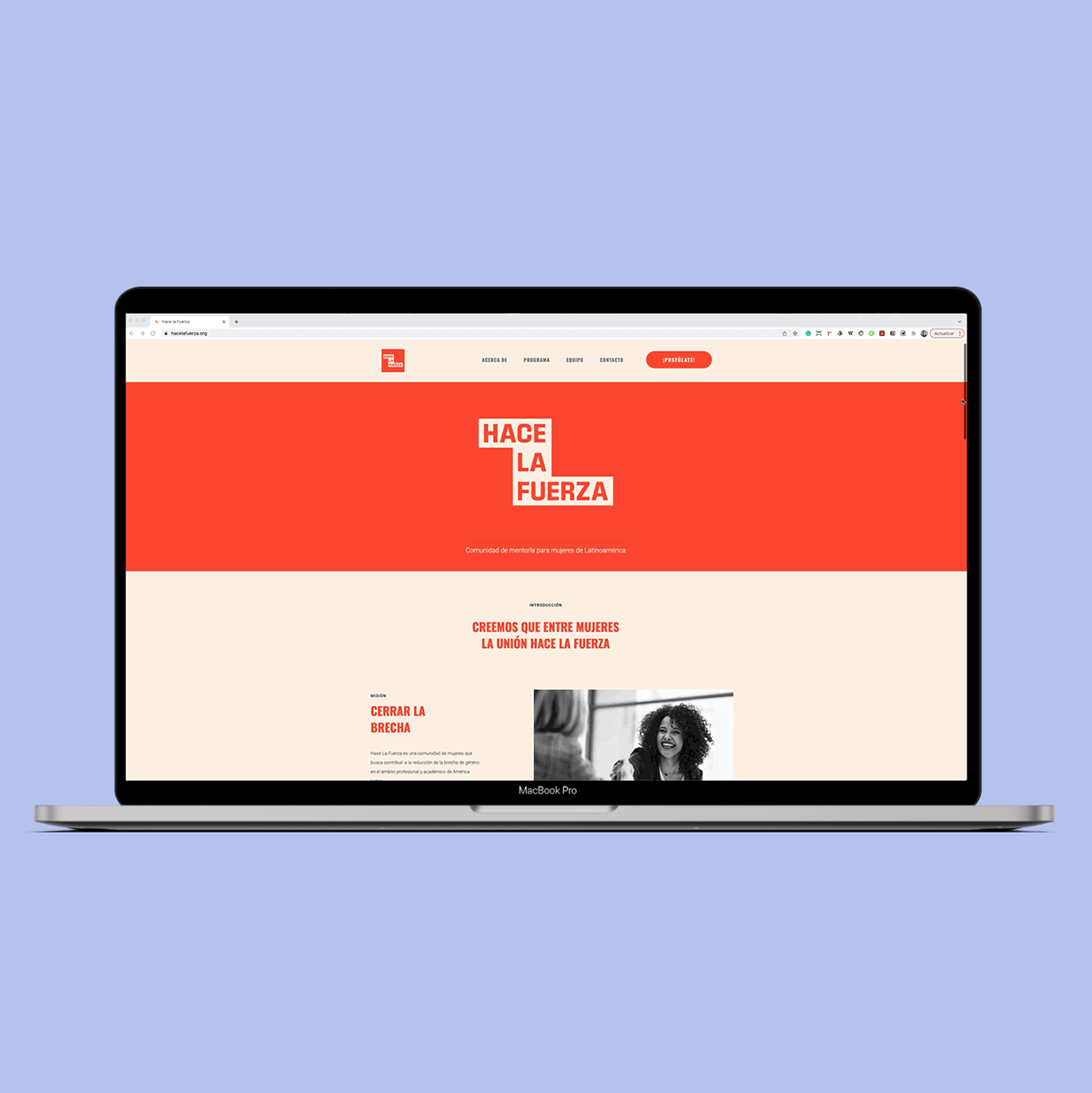 Image 6 of 16
 Image 7 of 16
 Image 8 of 16
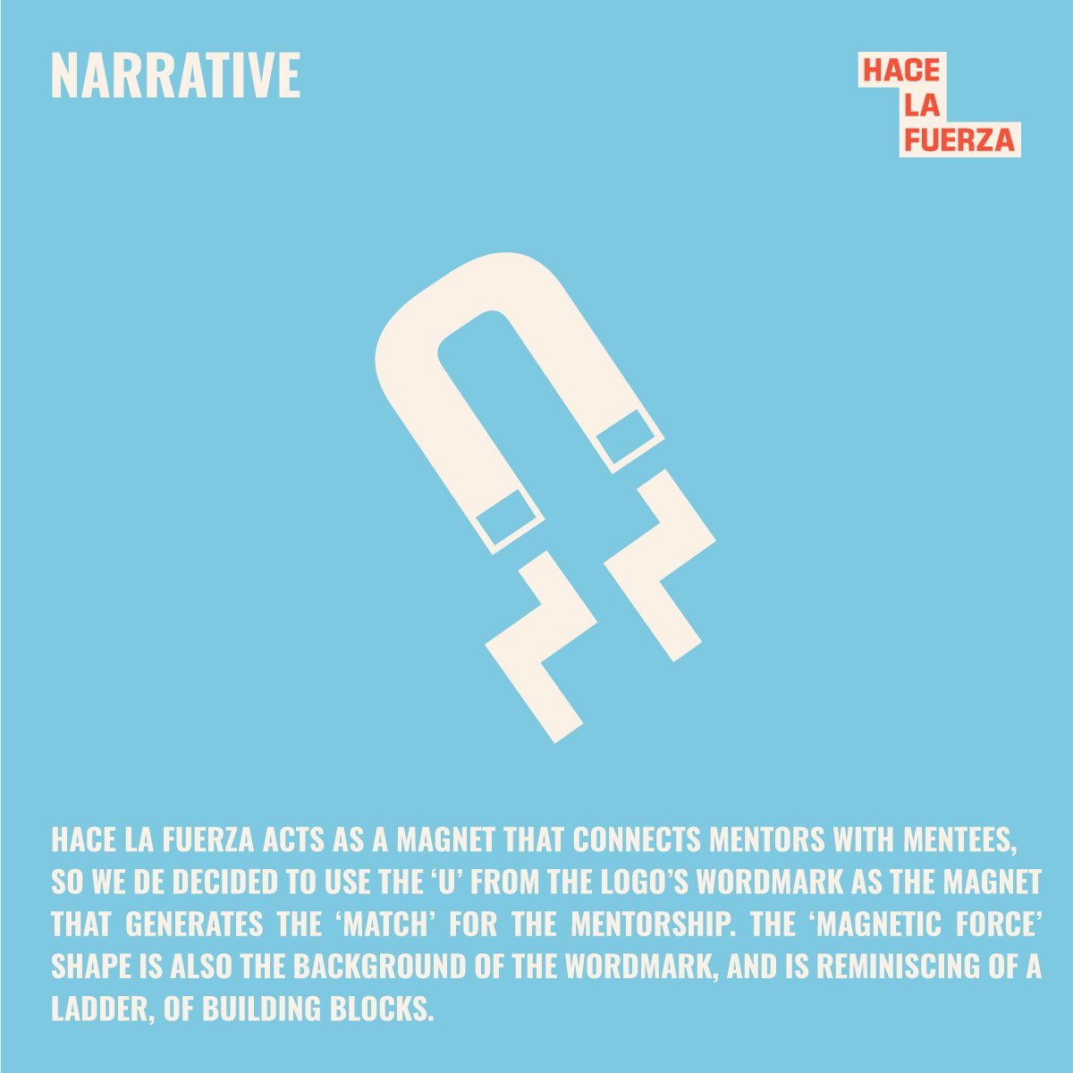 Image 9 of 16
 Image 10 of 16
 Image 11 of 16
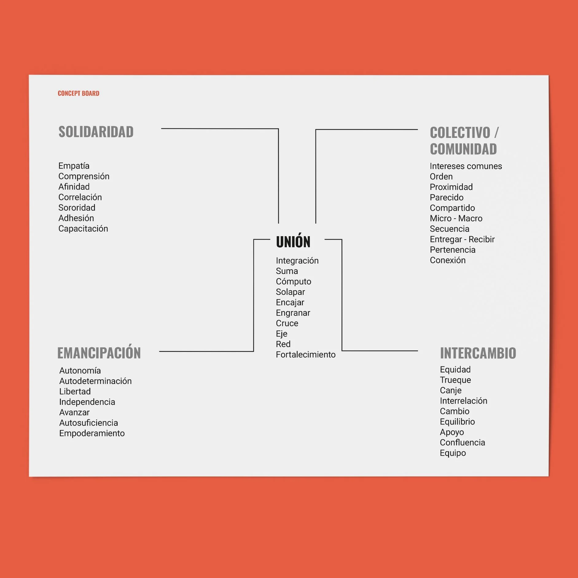 Image 12 of 16
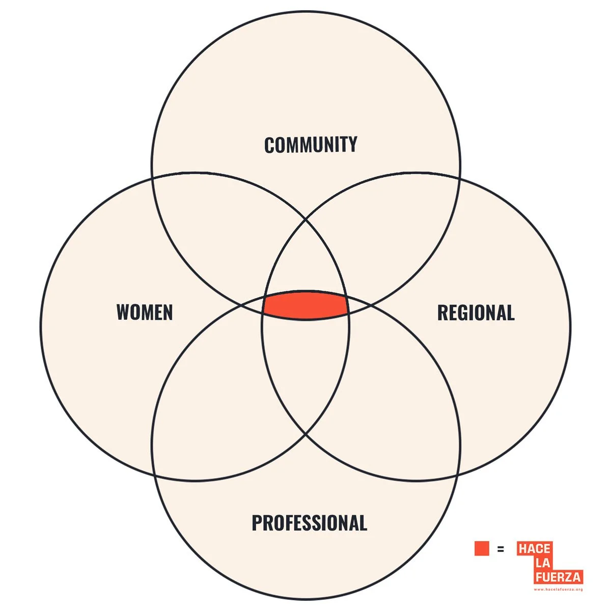 Image 13 of 16
 Image 14 of 16
 Image 15 of 16
 Image 16 of 16